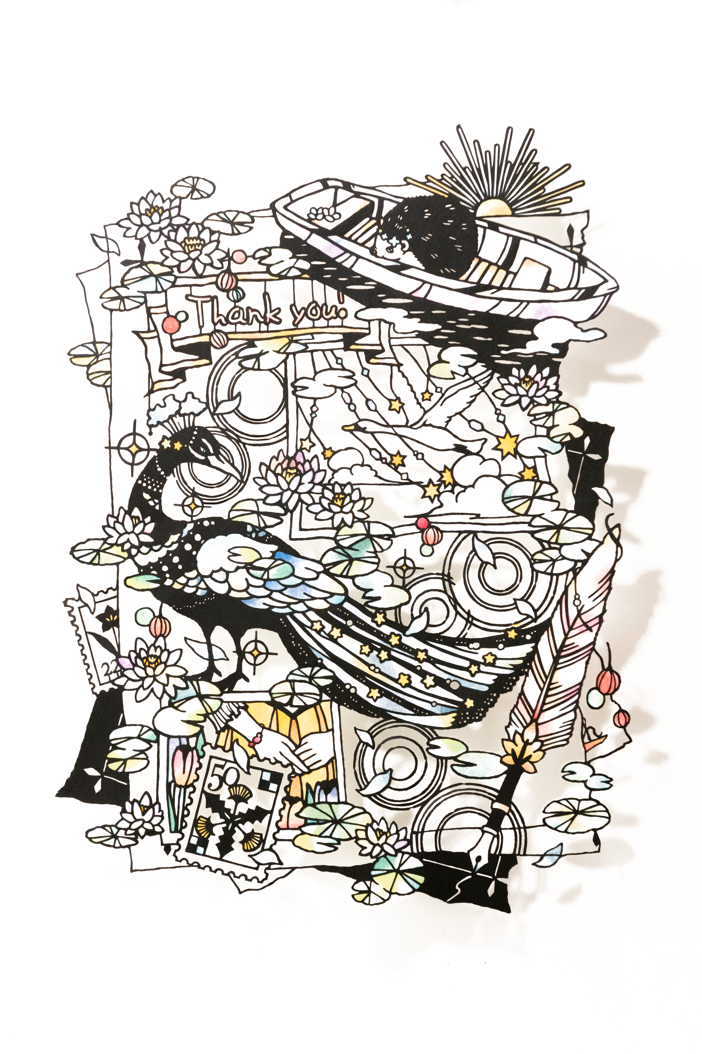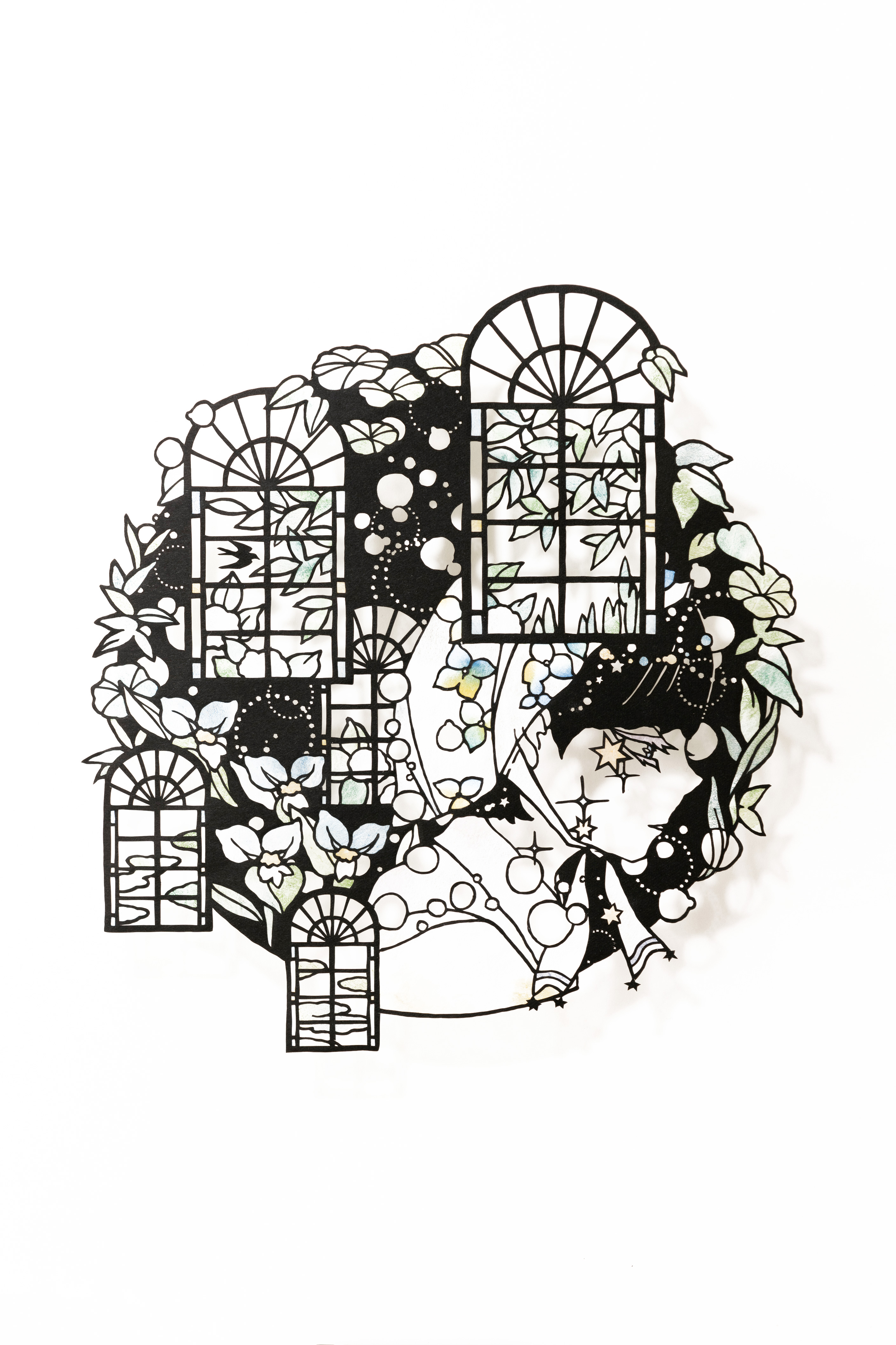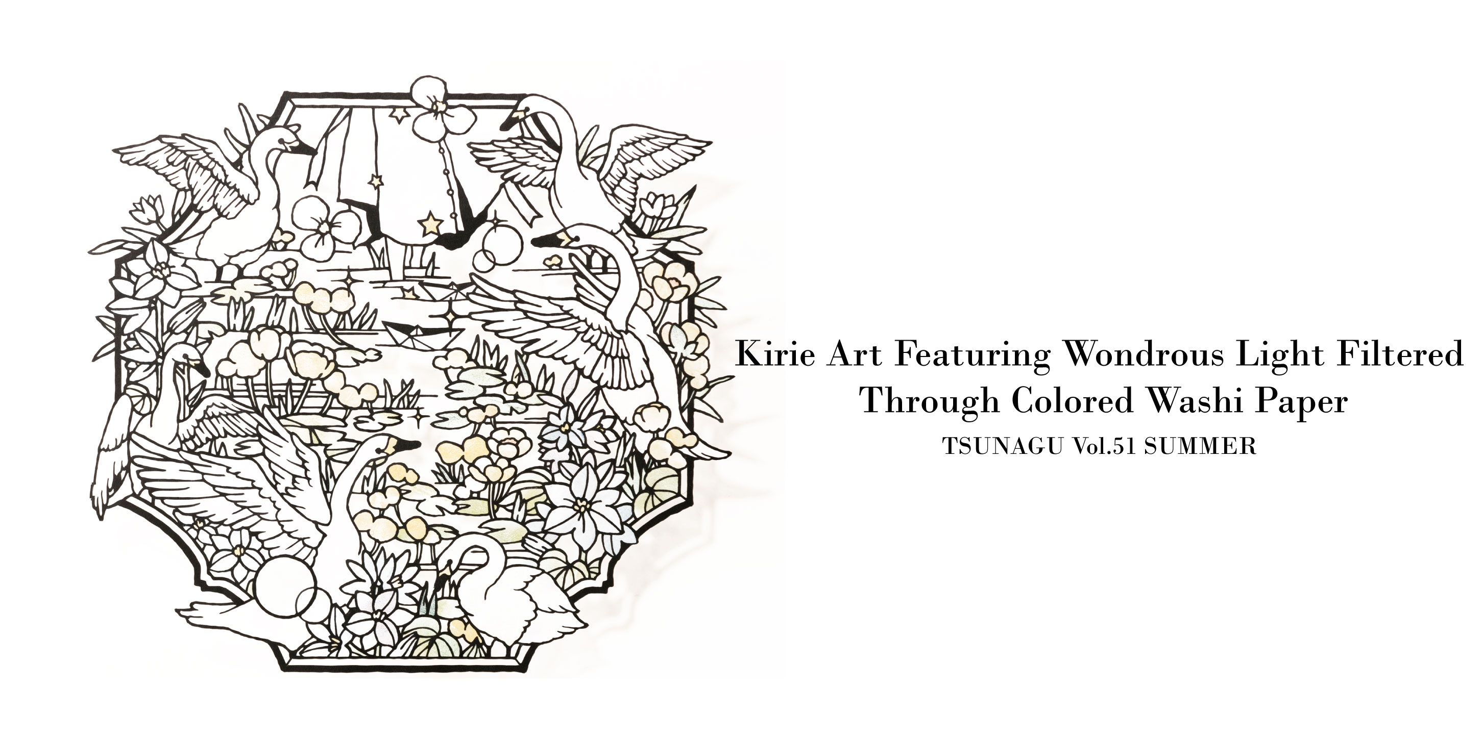
Dramatic compositions evocative of stories… Hand-dyed washi permeated by beautiful, nuanced light… Kirie paper-cutting artist Shinobu Ohashi continues to fascinate fans from Japan and around the world with her artwork. She not only employs sophisticated techniques to make cuts less than 0.5 mm thick, but expresses a lyrical worldview imbued with wondrous beauty as well. Here we take a closer look at how Ohashi’s standout kirie art is created and what the wellspring of her creative activities might be.
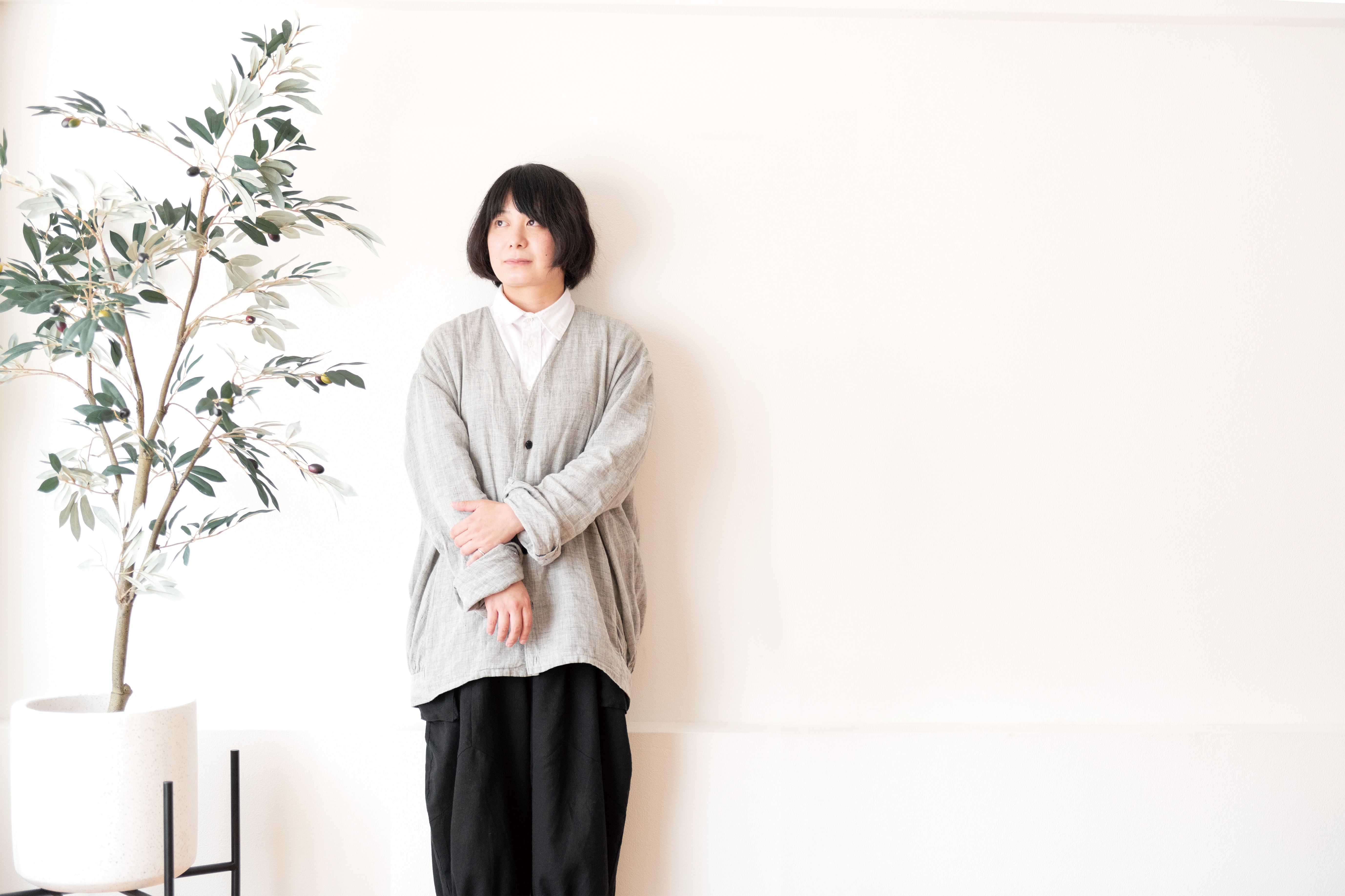
Shinobu Ohashi
Born in Fukushima Prefecture, she began making kirie with black drawing paper and colored washi soon after admittance to Bunsei University of Art and presented her original work on social media and at exhibitions. After an experience working as a company employee following graduation, in 2015 she published Utsukushii Kirie (“Beautiful Kirie,” MdN Corporation), her first design collection of newly commissioned work. This attracted attention to her artwork, which is expressive of her unique worldview, and led to its use in many corporate advertisements. Since then, she has actively participated in a range of fields, from producing goods featuring motifs from her artwork and publishing books to designing title logos for comics and anime works.
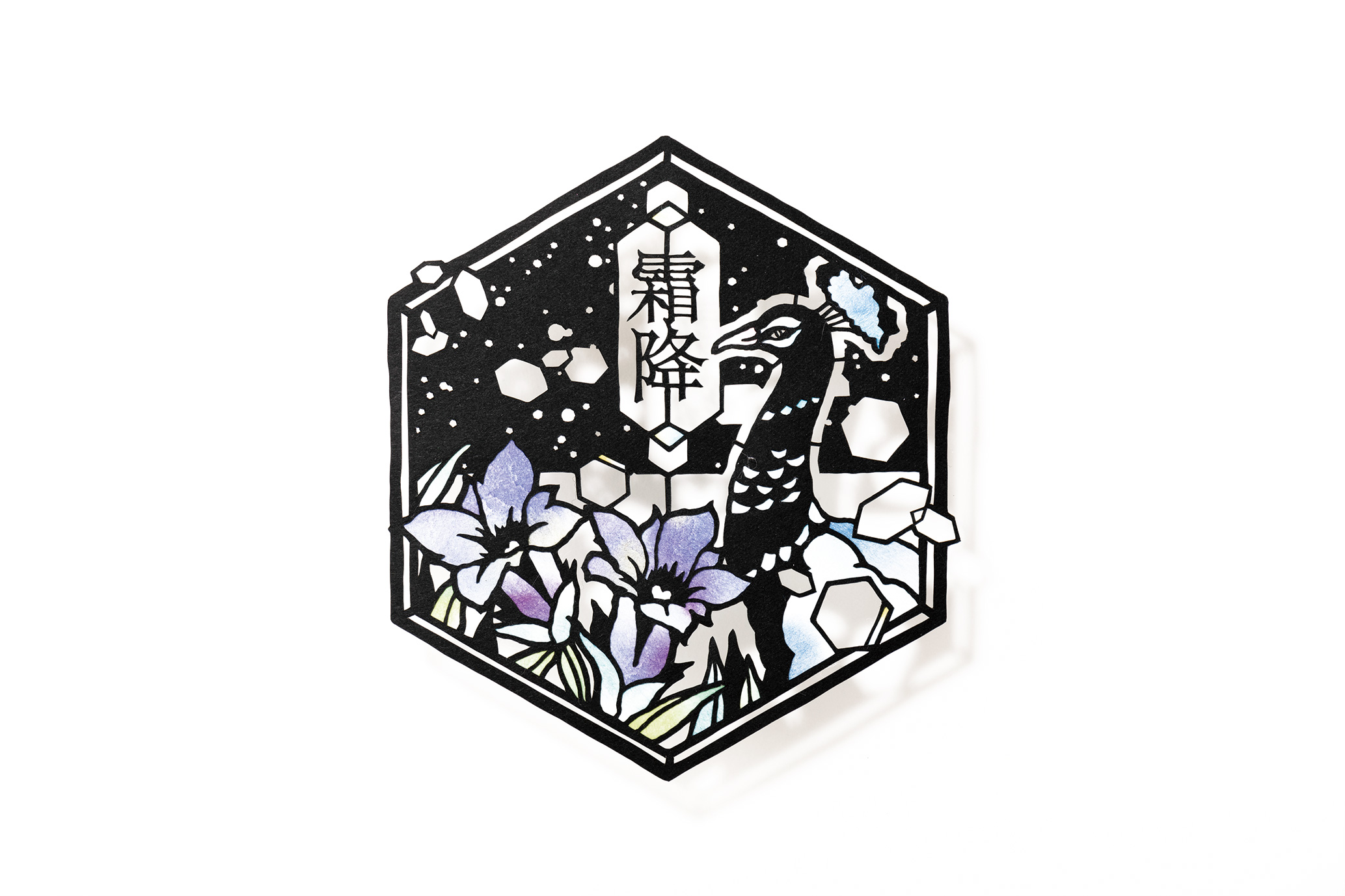
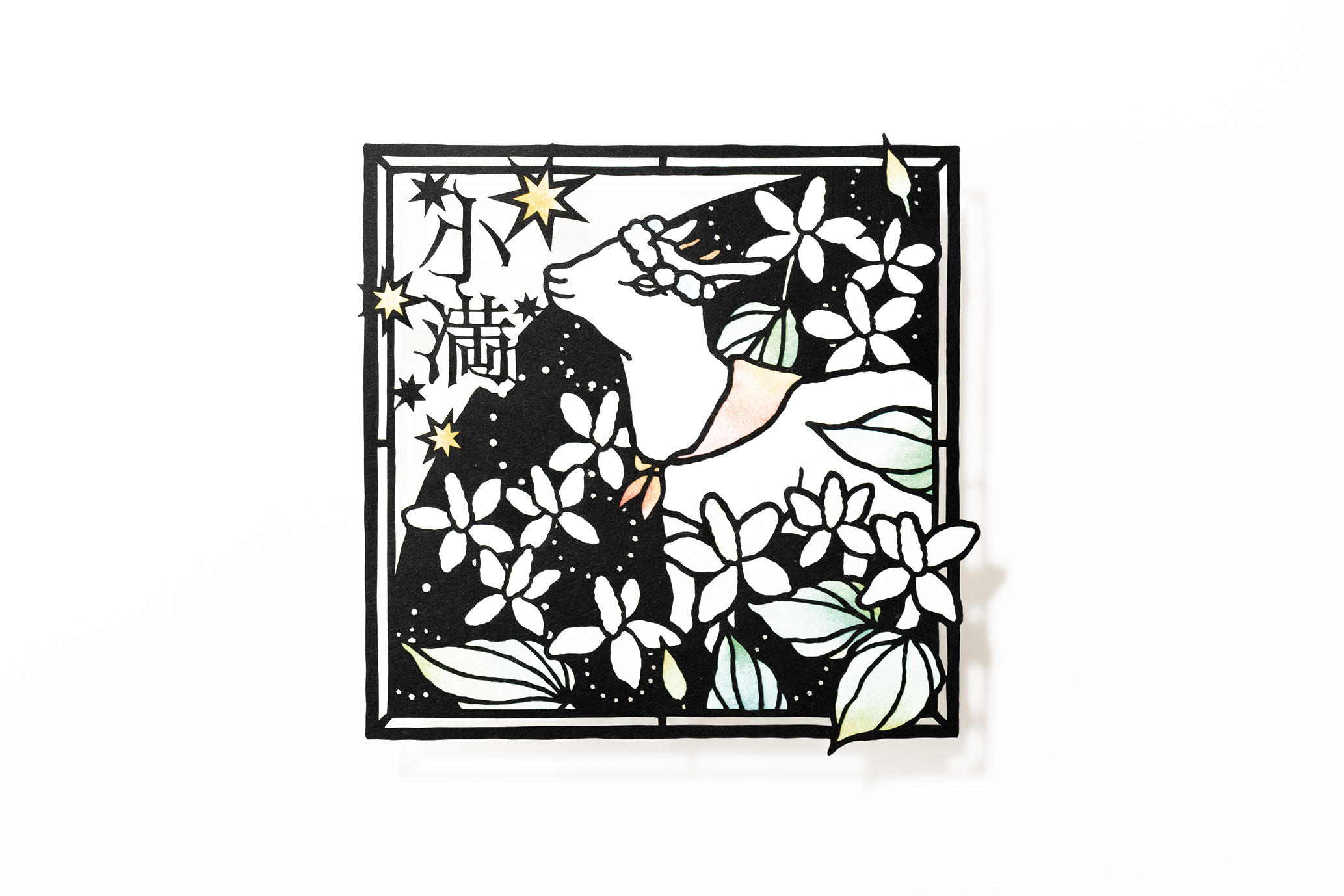
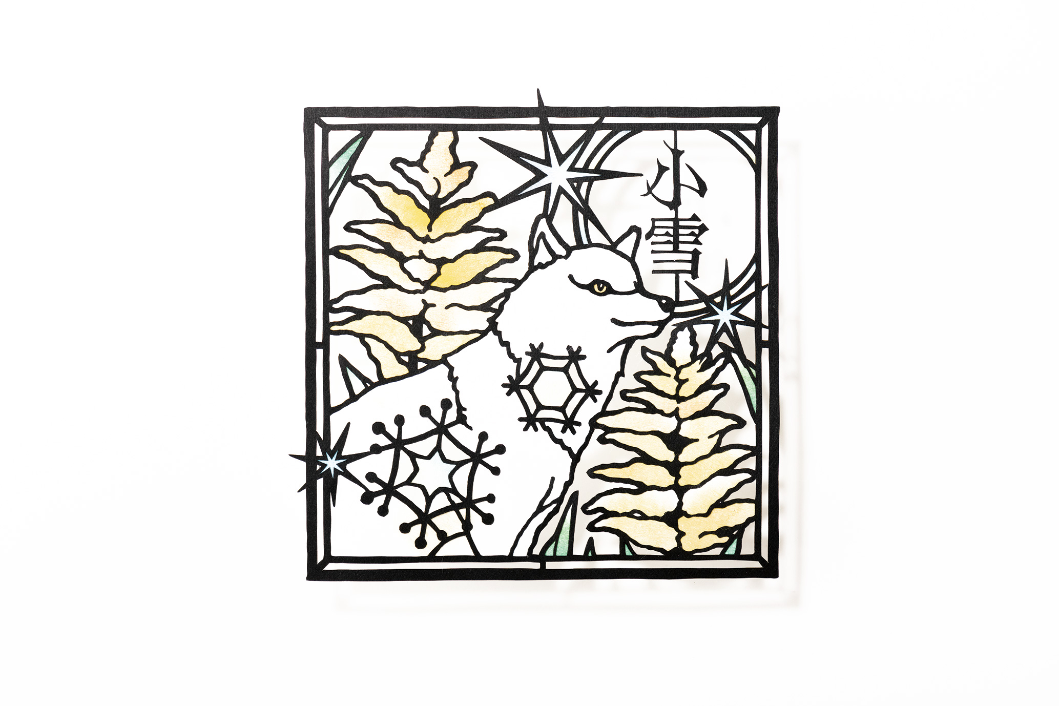
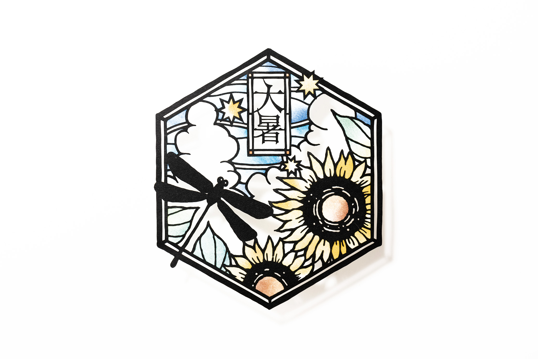
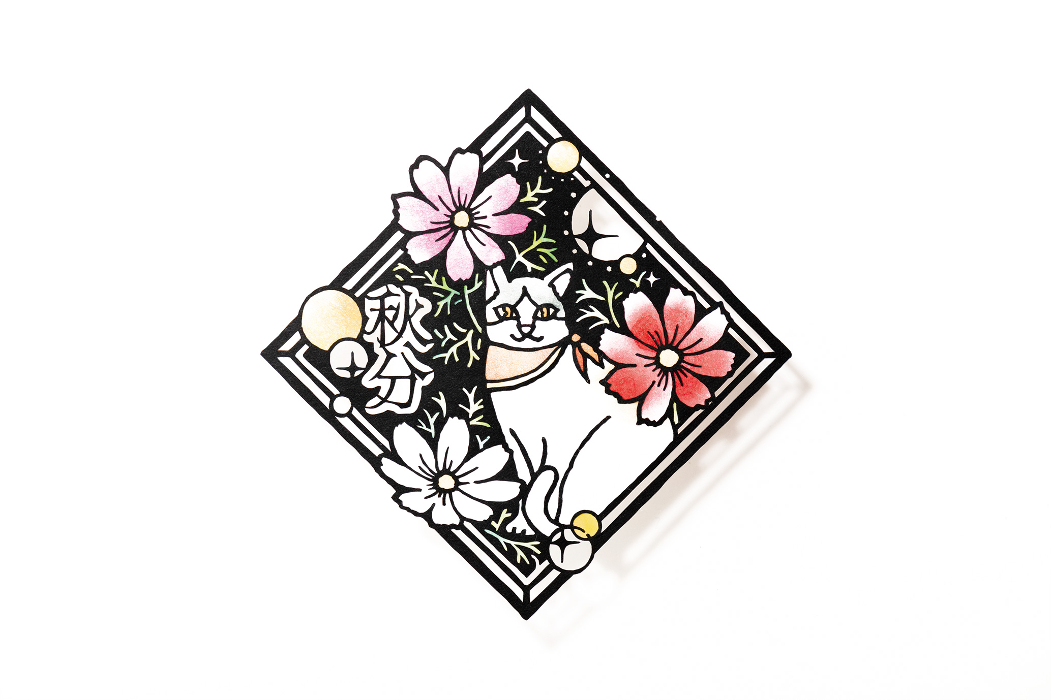
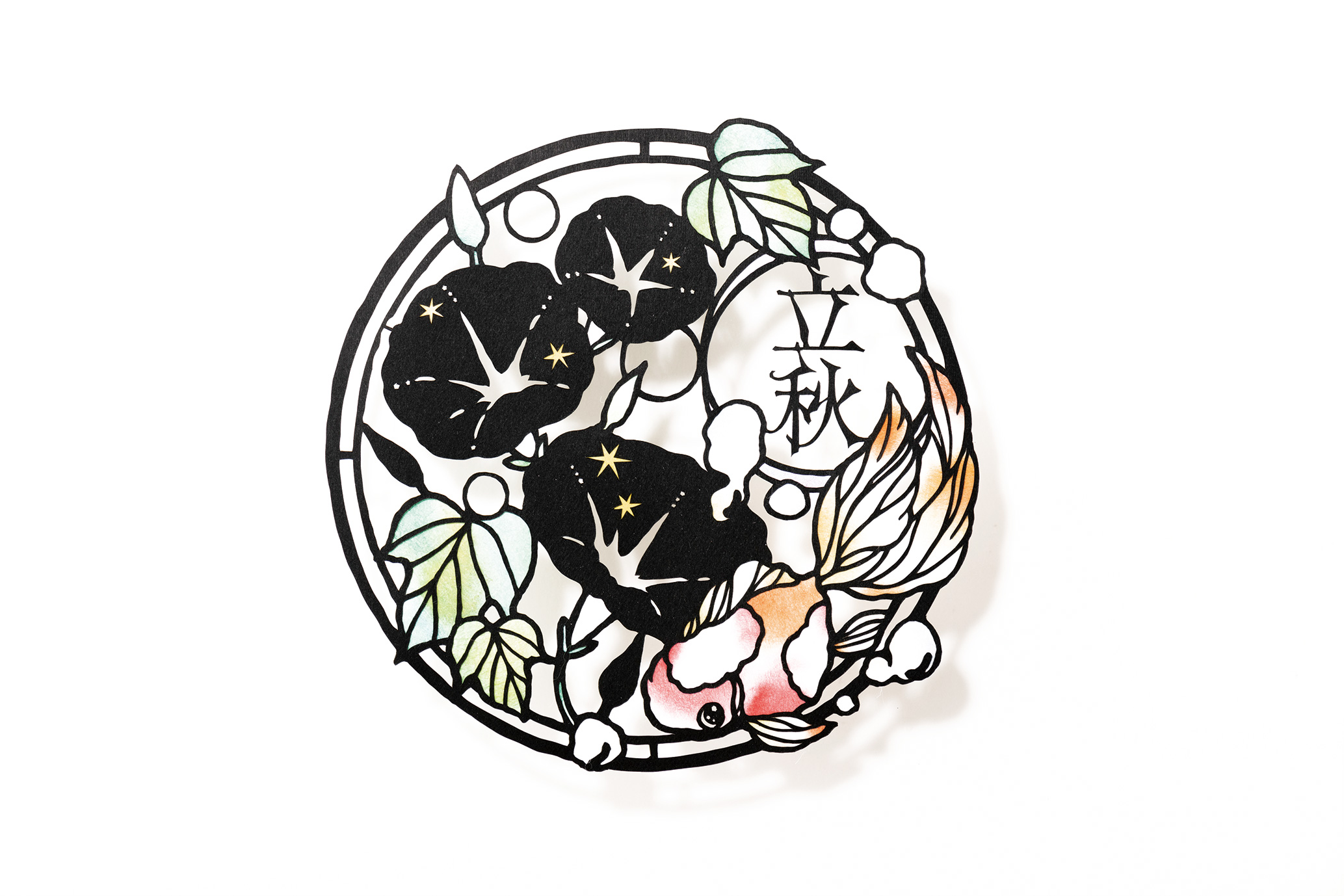
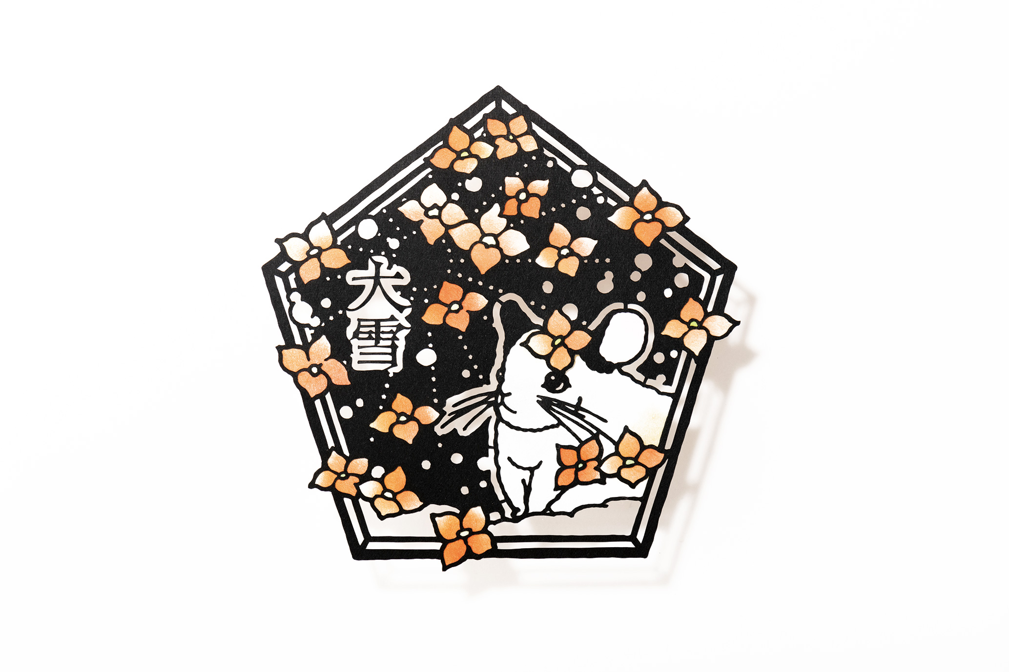
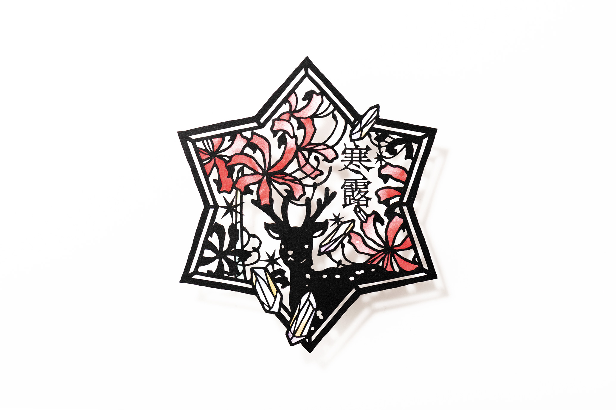
Paper art featuring short stories condensed onto single sheets and washi permeated with colorful light
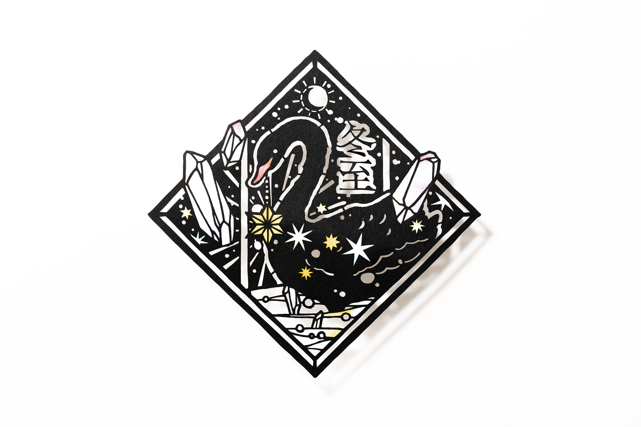
Using a special design knife with a thin blade, she creates single-sheet images with seamless lines, leaving just the outlines of her design sketches. Expressing lines that are sometimes powerful and sometimes delicate, kirie is a popular form of paper art that can be started with a bare minimum of tools. Most commonly, black paper is used to create monochromatic imagery in black and white, but kirie artists are employing an increasingly broad range of expressive techniques as well, with brilliant multi-colored pieces, materials other than paper, dimensional work with countless layers of paper and more.
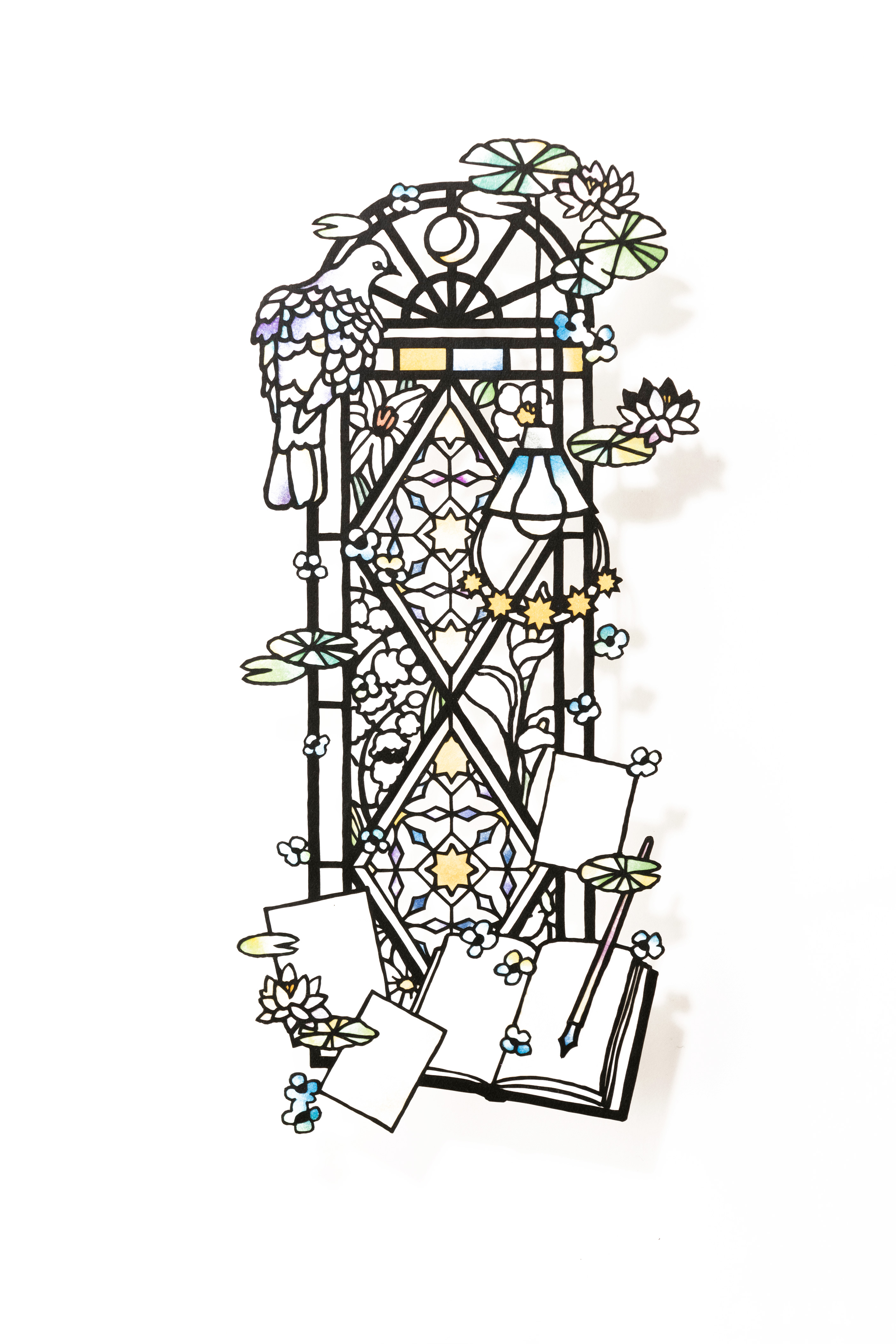
One charming feature running through Ohashi’s pieces is a lyrical worldview that seems to extract and capture particular scenes from stories. “My approach is to settle on certain ‘words’ as themes for my pieces, then start putting together an image of the colors and design from there.” The literary expressions she uses in her titles stand as testament to this: Akari ni Sosogu (“Rinsed in Light”), Ikuha Meguru (“Around Some Feathered Wings Come”), Hanaryokusho Daku (“Emerald Green Embrace”). “A lot of the themes in my work come from feelings that well up in me reading novels or listening to music. It’s like those feelings will mix with my own memories, and the imagery starts to develop and expand from that,” she explains.
There seems to be an unexpected background to the way ideas for her surprising motifs and designs and creative use of color occur to her as well. “This might sound a bit dubious, but are you familiar with ‘synesthesia’? It’s a mental phenomenon where certain colors appear in conjunction with different letters or numbers, or with sounds you hear. Apparently, there are many different types. In my case, when I see letters or numbers, I automatically get a sense of the ‘color’ attached to each one.
For example, the letter ‘a’ will be associated with the color red, ‘i’ with light blue and white, ‘u’ with pink… When I read novels or listen to music, colors, lines, and designs will pop into my mind. My approach is akin to a process of incorporating those into my work.” The colors linked to each letter can change depending on the word or sentence, so the nuanced coloration varies from one piece to another, she says.
Minutely detailed portions are cut first, and finally the outer outlines.
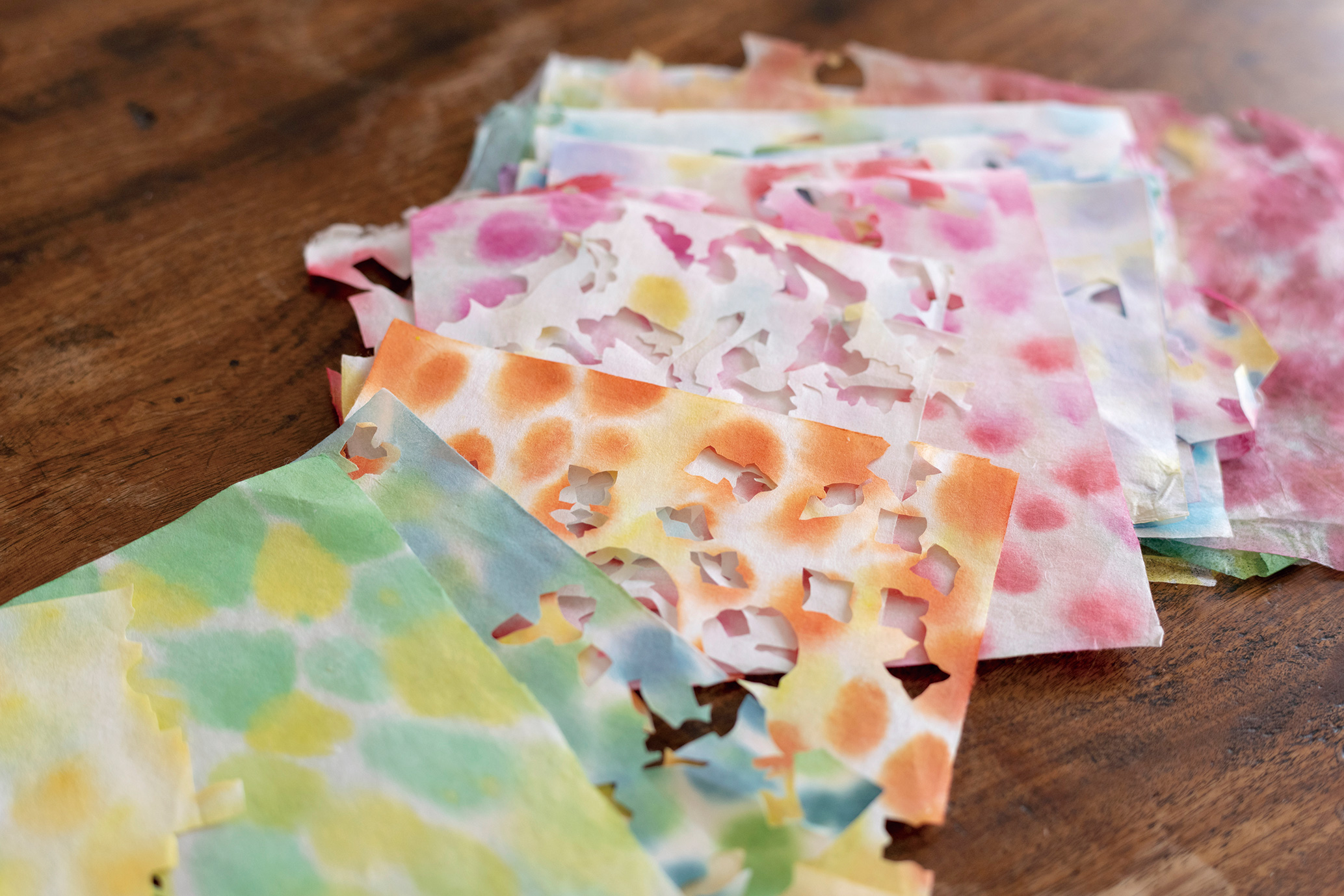
Hand-dyed washi is cut out to match the design sketches.
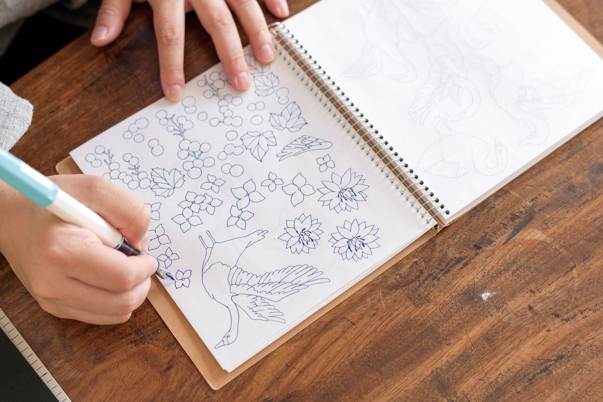
She uses a sketchbook to draft the design for the piece she has in mind.
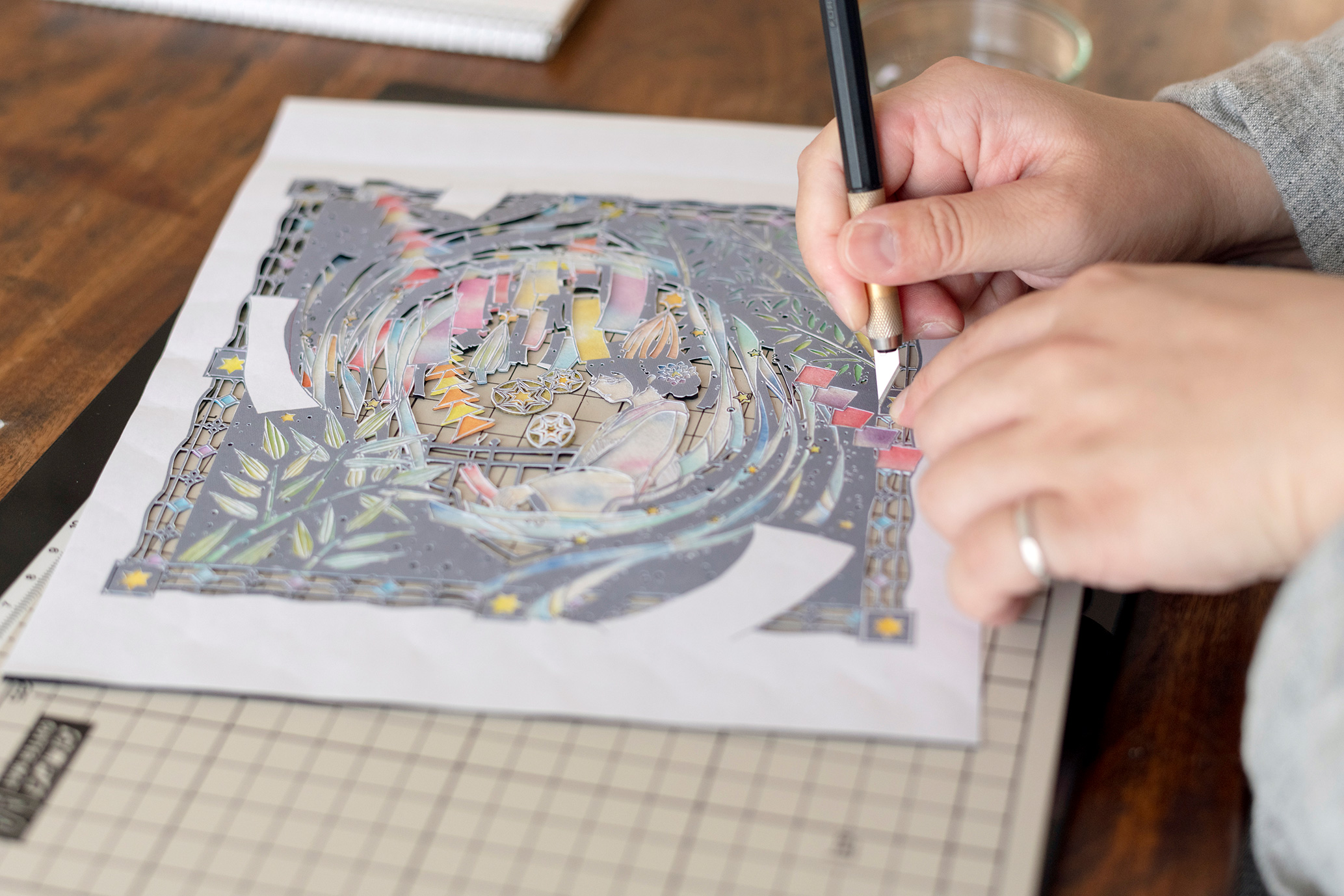
Ohashi imports preliminary drawings into her computer to make layout adjustments. After printing collaged sketches on white paper, she overlays them with black drawing paper and begins running the design knife along the outlines of the motifs, lettering and so on.
“The black drawing paper I use is Muse High Black. It’s matte black paper and tends to give a clean cut, plus it’s nice and strong, so it’s long been a favorite of mine,” she explains. Ohashi goes on making cuts to reveal minutely detailed portions like little leaves on trees and gently curved lines, as if drawing them with a pen.
She then proceeds to the next stage in her creation process. With superfluous portions trimmed away, the drawing paper is left with only the outlines of the image’s component parts, and on the back, she starts affixing washi with nuanced tones of color.
“I use hand-dyed washi to reveal the subtle beauty of the light that passes through it. Up through high school I used off-the-shelf washi, then I came to start dyeing my own based on advice from a university professor. I’ve tried out all different kinds but decided to go with Wakasa Washi, which stays strong when moistened with water and doesn’t warp when dried. I really like the way the color spreads when I dye it.” From the stained glass-like beauty of the work to its air of gentleness and lyrical quality, the washi plays a pivotal role in expressing the unique worldview that characterizes Ohashi’s art.
Surprisingly enough, though, she reveals, “When I was little, I didn’t care for drawing or arts and crafts all that much.” Praise she received for a picture of plants she drew for a homework assignment led her to realize the pleasure of drawing, though there was then also a time when she lost her confidence in middle school seeing the abilities of other members in her art club.
“I was self-conscious of the fact that I wasn’t so skilled at drawing and struck on the idea of making kirie as a method of expression that could make up for my lack of drawing skills. As I kept making kirie throughout my high school and university years, the turning point came when an editor from a publishing house approached me at the Design Festa exhibition. Publishing a design collection of my own helped forge connections with a range of different people for me.”
Each of the works she has published since then, at a pace of one a year, have become bestsellers. In addition to having her work featured in many corporate advertisements, both in Japan and around the world, she has been inundated with requests to supply her kirie artwork for projects or to participate in collaborations. While too numerous to list, these have included having her work used for the title logo of the popular anime television series Fumetsu no Anata e (“To Your Eternity”) and the lettering used on the cover of the popular comic No Problem Kazoku (“No Problem Family”).
Ohashi is energetic and busy—producing her artwork, holding solo exhibitions, creating designs to include in her books, responding to collaboration requests for all different types of media, and also managing the production and sales of her own original goods. When asked what she would like to try her hand at next, she replies, “I’d like to take a shot at stop-motion animation made with kirie, and one other thing I’d like to do is start offering kirie-making lessons in my own studio. I would love for more and more people to come to know the special charms of this artform and the joy of creating it.” The artwork and activities Ohashi has to offer in the days ahead should not be missed.